View the albany paint entry on BPindex
Visit the Albany Paint website
Albany Paints is celebrating 100 years of colouring people’s homes.
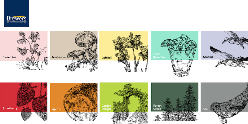
Colour is a powerful tool in interior decoration, it gives character, adds dimension and expresses personality. Certain shades have close links with bygone eras, which tell us a story with depth and meaning often influenced by fashion, art and pop culture of the time. To celebrate this language of colour, here is a specially curated palette honouring Albany’s rich history of colour with iconic shades from each decade.
 Albany is a trusted paint brand used by professionals and DIY-ers alike. Each finish is made to a high-quality trade recipe, rich in pigment and high-quality ingredients for superior colour depth and retention. Albany paint is exclusively available online or in-store at Brewers Decorator Centres.
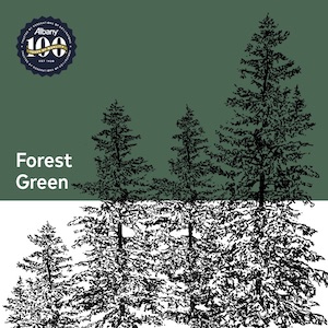
Forest Green (1920s) – Synonymous with the Art Deco era, Forest Green is a deep jade with a hint of black which provides depth and character.
Sea Bird (1930s) – Sea Bird is a delicate grey blue. A favoured shade of the 30s that creates a sense of calm and tranquillity.
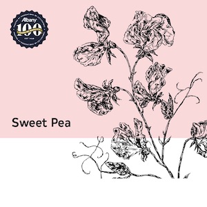
 Sweet Pea (1940s) – The grounded blush pink is a 40s favourite. Bring Sweet Pea up to date with dark, inky accessories.
Daffodil (1950s) – Daffodil is a soft, happy yellow that brings the sunshine in, enveloping a room in warmth and character regardless of era.
Thirst Quencher (1960s) – This fresh aqua is often considered retro but works equally well in a modern home. It’s a pure shade that can be muted with soft pastels or kept cool and crisp with white.
Apricot (1970s) – Bold and bright, Apricot is and arresting shade with a strong relationship with the 70’s where earth and spice tones were considered all the rage.
Strawberry (1980s) – The delightful Strawberry is a striking berry red that maintains a strong sense of colour for high impact schemes.
Mushroom (1990s) – This earthy Mushroom tone is a fine example of an easy neutral coveted in the 90s and is currently back in favour.
Garden Delight (2000s) – Garden Delight is an energisingly zesty lime green, a popular shade of the noughties. Use sparingly in unexpected details for a modern touch.
Seal (2010s) – Seal is a charming mid-grey, a homage to most popular interior colour of the past decade.

